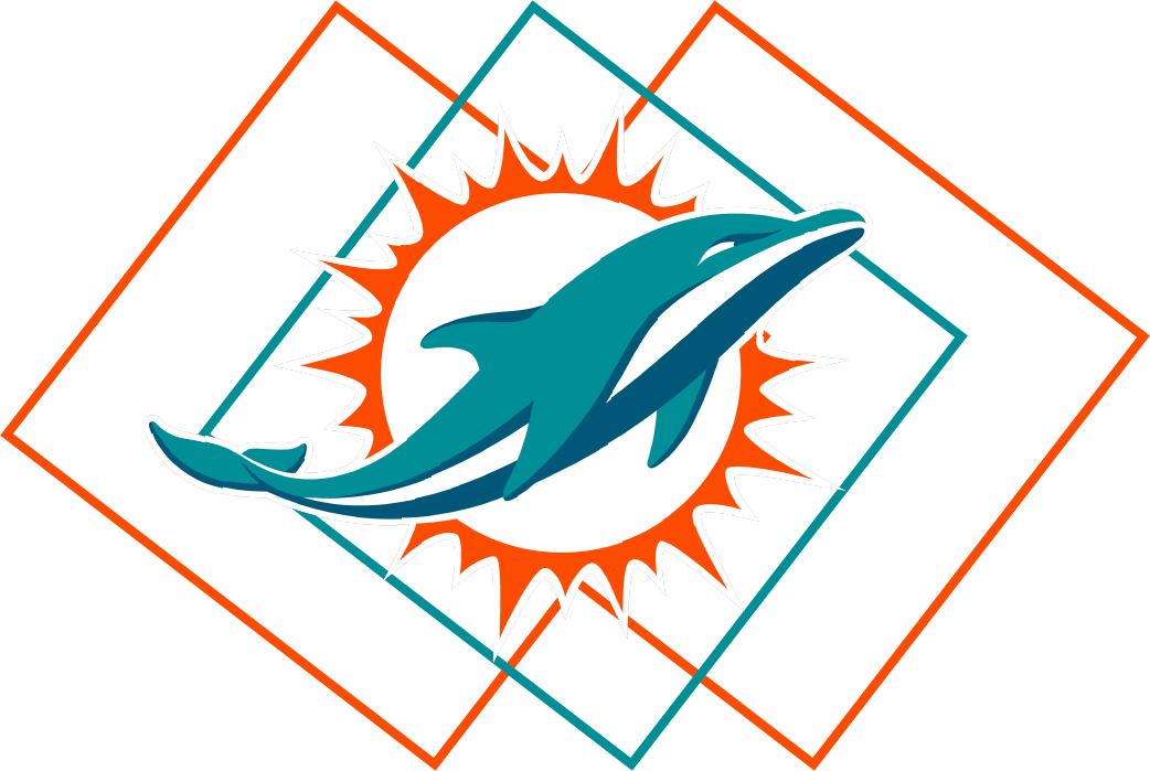
Miami Dolphins Case Study Project
Big idea
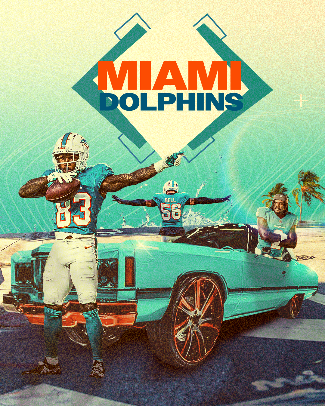
Miami is more than football. This identity system blends South Florida culture, ocean energy, and the team’s speed into a bold visual language. Using artistic styles such as Art Deco and Japanese woodblock illustrations the Miami Dolphins find a new meaning to football.
The Gap
The Dolphins celebrate their history well, but there’s an opportunity to better incorporate South Florida’s inner city culture into a modern visual system.
Objective
Create a visual identity that combines speed, intelligence, and South Florida culture into a system that feels energetic and strategic.
Typeface
Primary Font - Owner Text
Secondary Font - Avenir
Accent Fonts - AM Augusta and Fifties Variable semi condensed bold
Color System
The campaign uses Miamis primary colors while incorporating bright neon colors to emphasize the popular vice city aesthetic paired with Miamis fast paced energy.
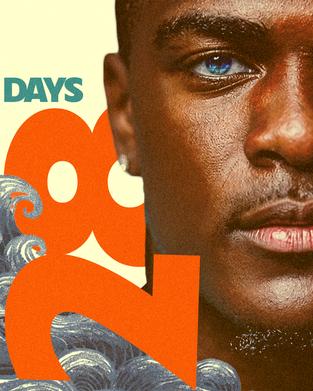
Social Media Graphics

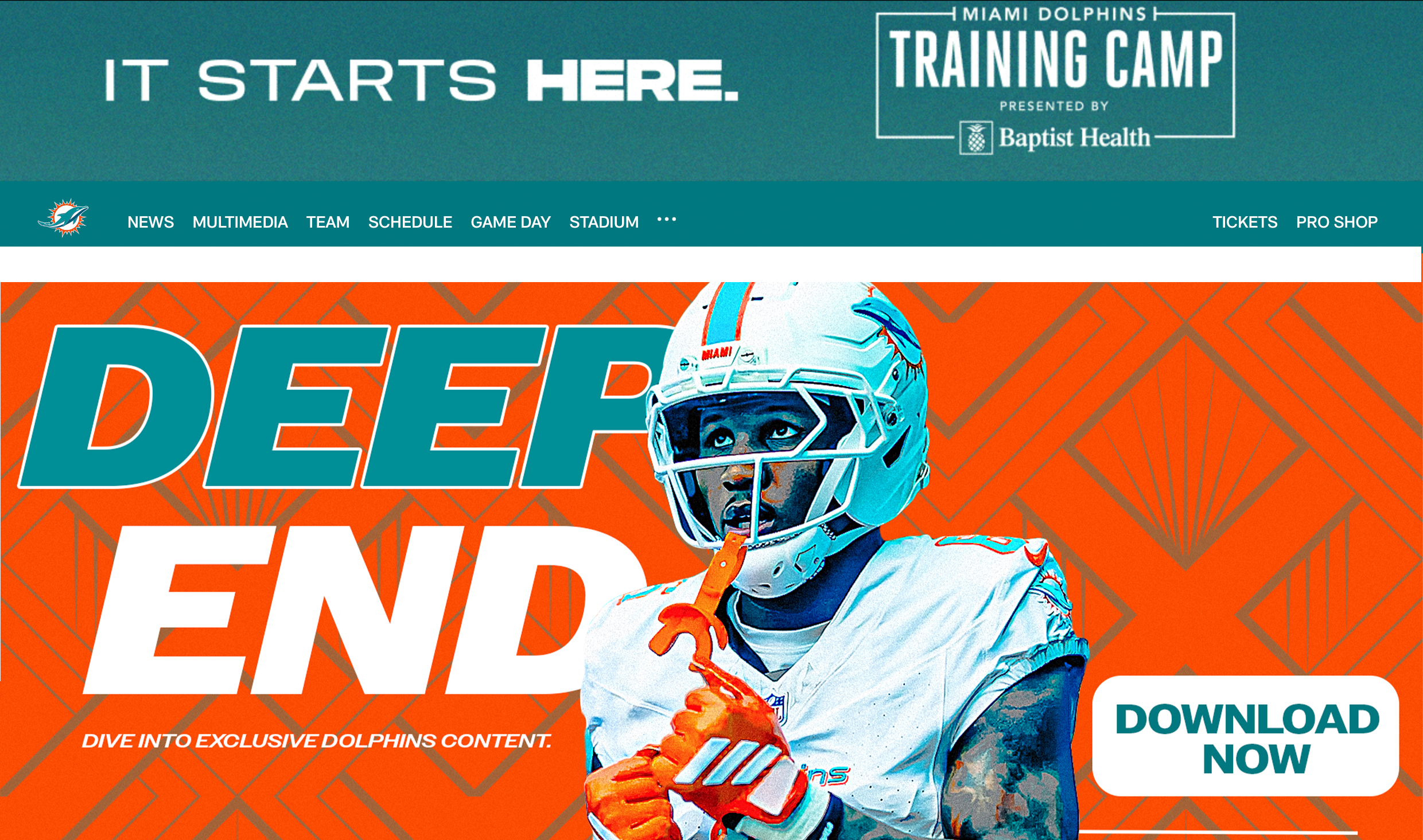
Website Banner

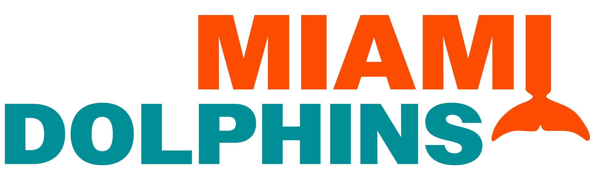
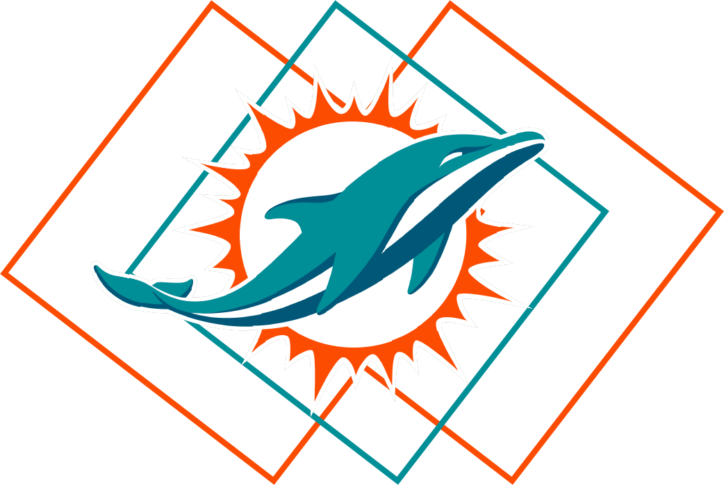
Logo Rebrand
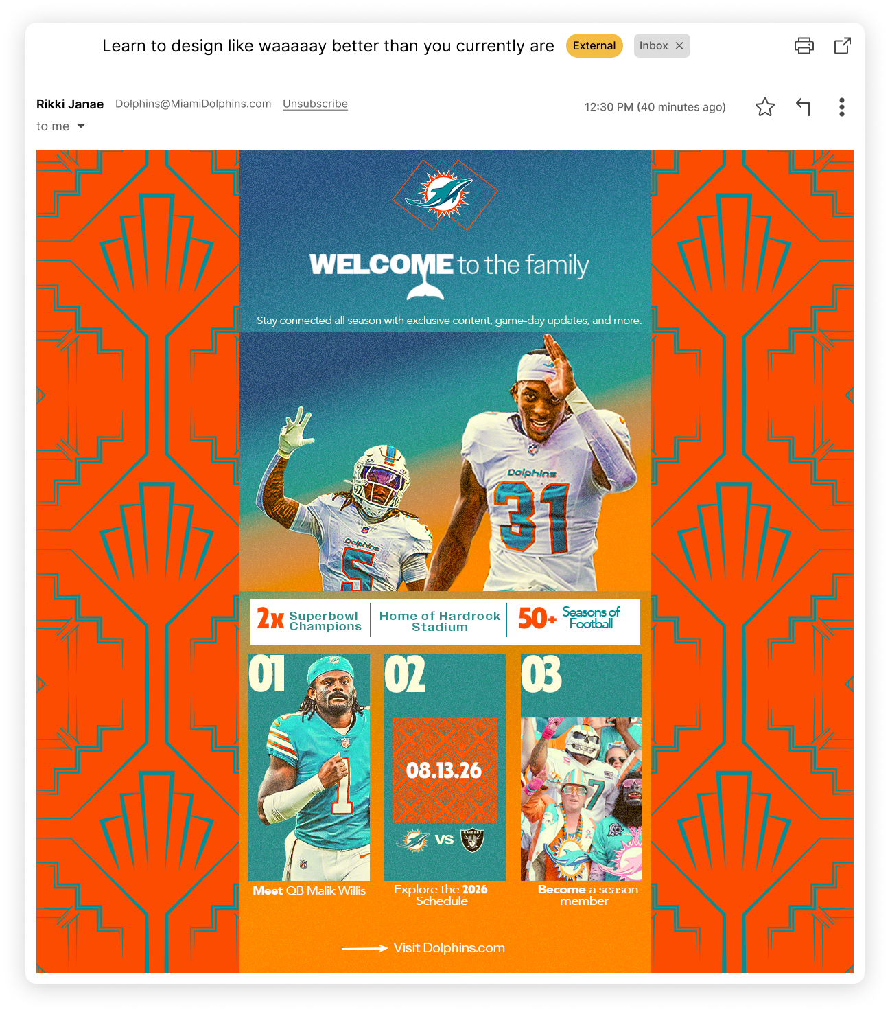
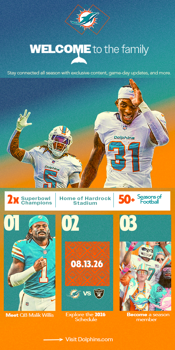
Email Design Concept
Final Score Template